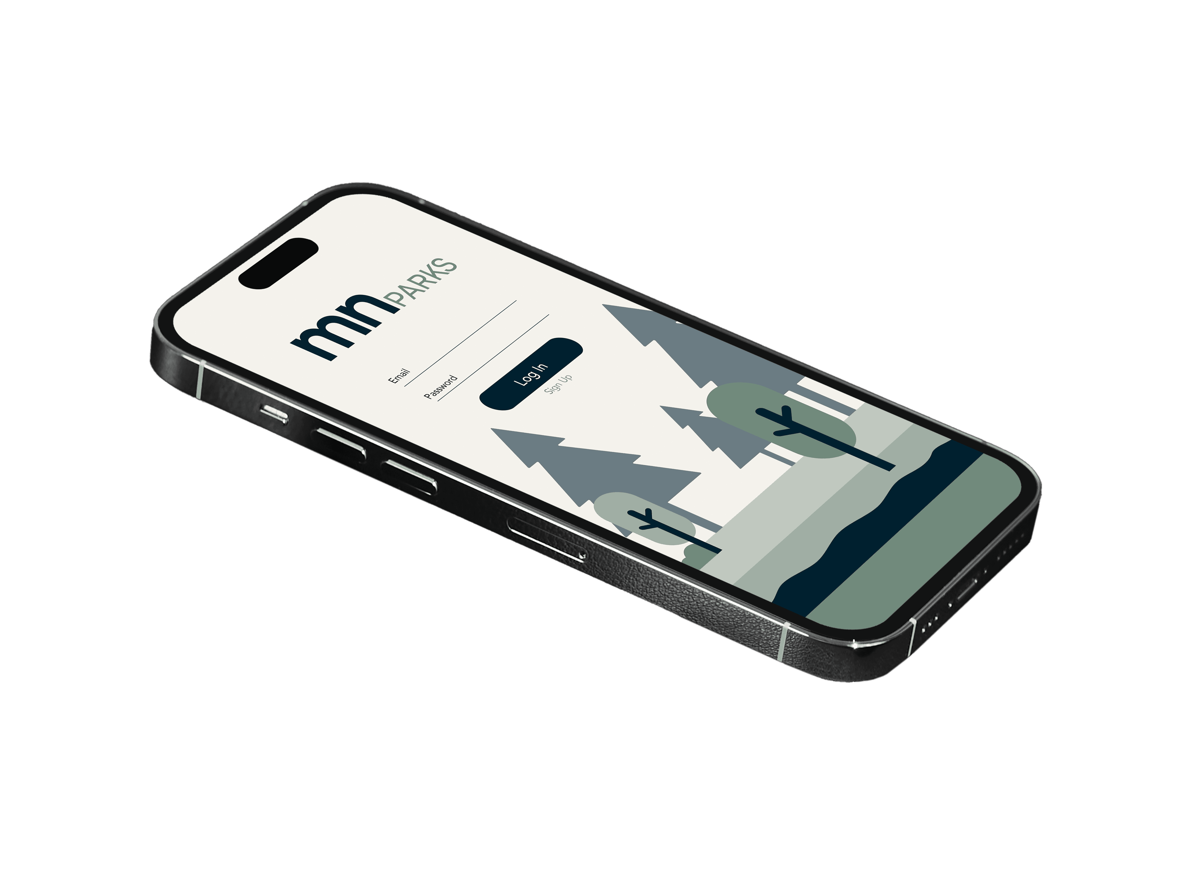
MN Parks
App Design
My Role
UX DESIGNER
Timeline
1 month
THE PROBLEM
Minnesota's state parks need a central hub of information for their respective parks across the state to enhance visitor experiences, increase accessibility, and promote the state’s natural resources.
THE OBJECTIVE
Provide an app tailored to Minnesota’s state park visitors and create deeper connections between people and nature while supporting conservation and tourism efforts.
RESEARCH
Target Audience
User Interviews
User Persona
PAIN POINTS
Bear Tracker
Number one concern of interviewers was wild animal encounters.
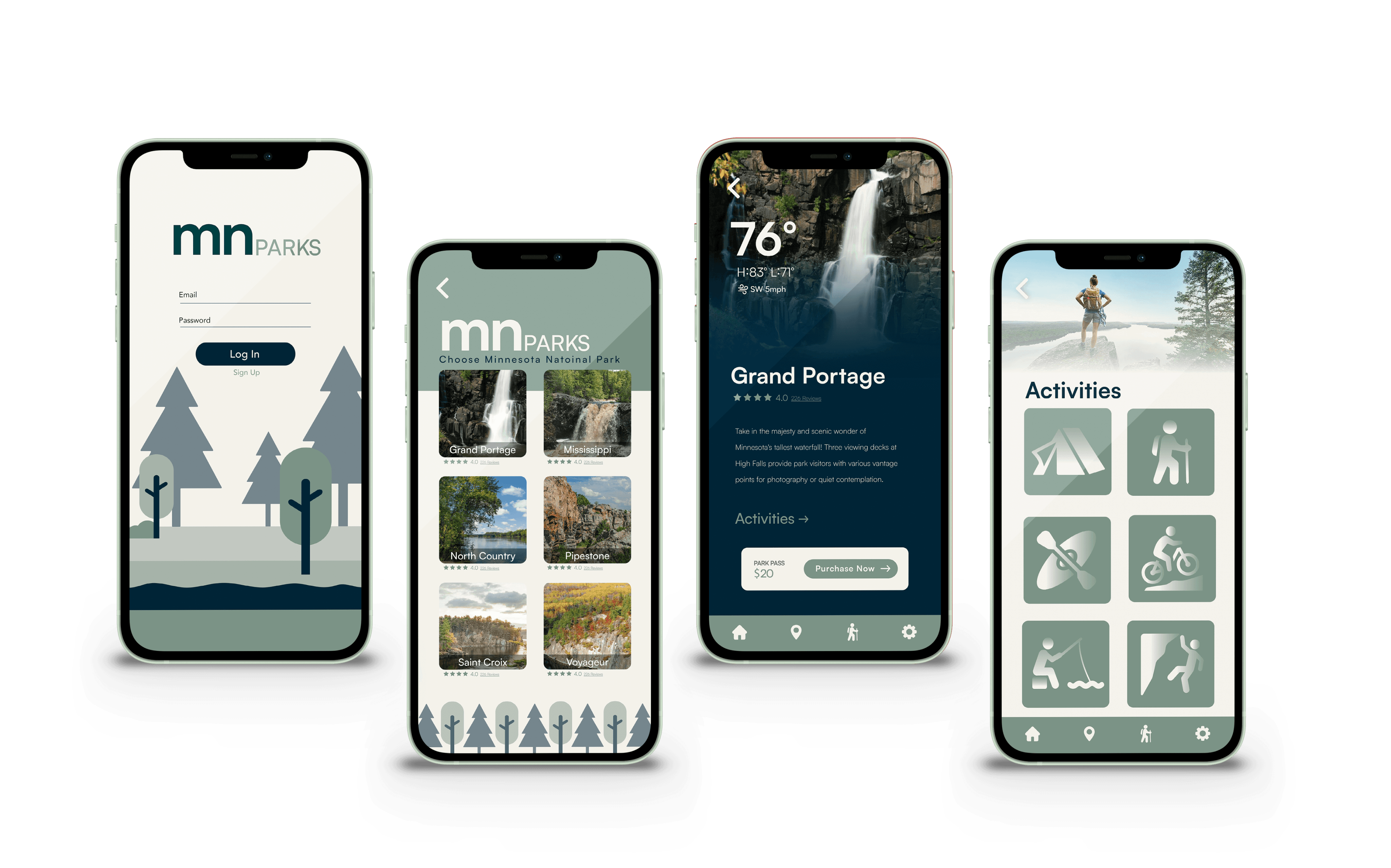
Activities
What type of activities and services does the park offer?
Trails & Maps
Accurate trails and maps to iconic destinations and campsites.
SOLUTIONS
Bear tracker that allows park rangers, or visitors to mark wild bear sightings in real time.
Activities section that shows activities available, with updated schedules and seasons.
Multiple maps and trail direction for hiking, rock climbing, and off road biking.
Color Palette
For the color process I used the 60, 30, 10, rule. The rule states that a color scheme should consist of three colors in intervals of 60% (main color), 30% (secondary), 10% (accents). By following this system it helps the design keep balanced proportions.
I chose cool colors for my palette to reflect the calmness and tranquility found in nature. Also, I chose variations of green and blue to imitate the color of grass and water, while using an eggshell white as the neutral color for the app.#F4F2EC
60%
30%
#719A7C
10%
#001F30
TYPOGRAPHY
Satoshi is a sans-serif typeface inspired by Modernist graphic design
Satoshi is a modernist sans serif typeface. Its design combines typically grotesk-style letterforms, with some characters that are quite geometrically-designed.
Satoshi is a modernist sans serif typeface. Its design combines typically grotesk-style letterforms, with some characters that are quite geometrically-designed.
Aa
Aa
Aa
Aa
Aa
Light
Regular
Medium
Bold
Black
Info Architecture
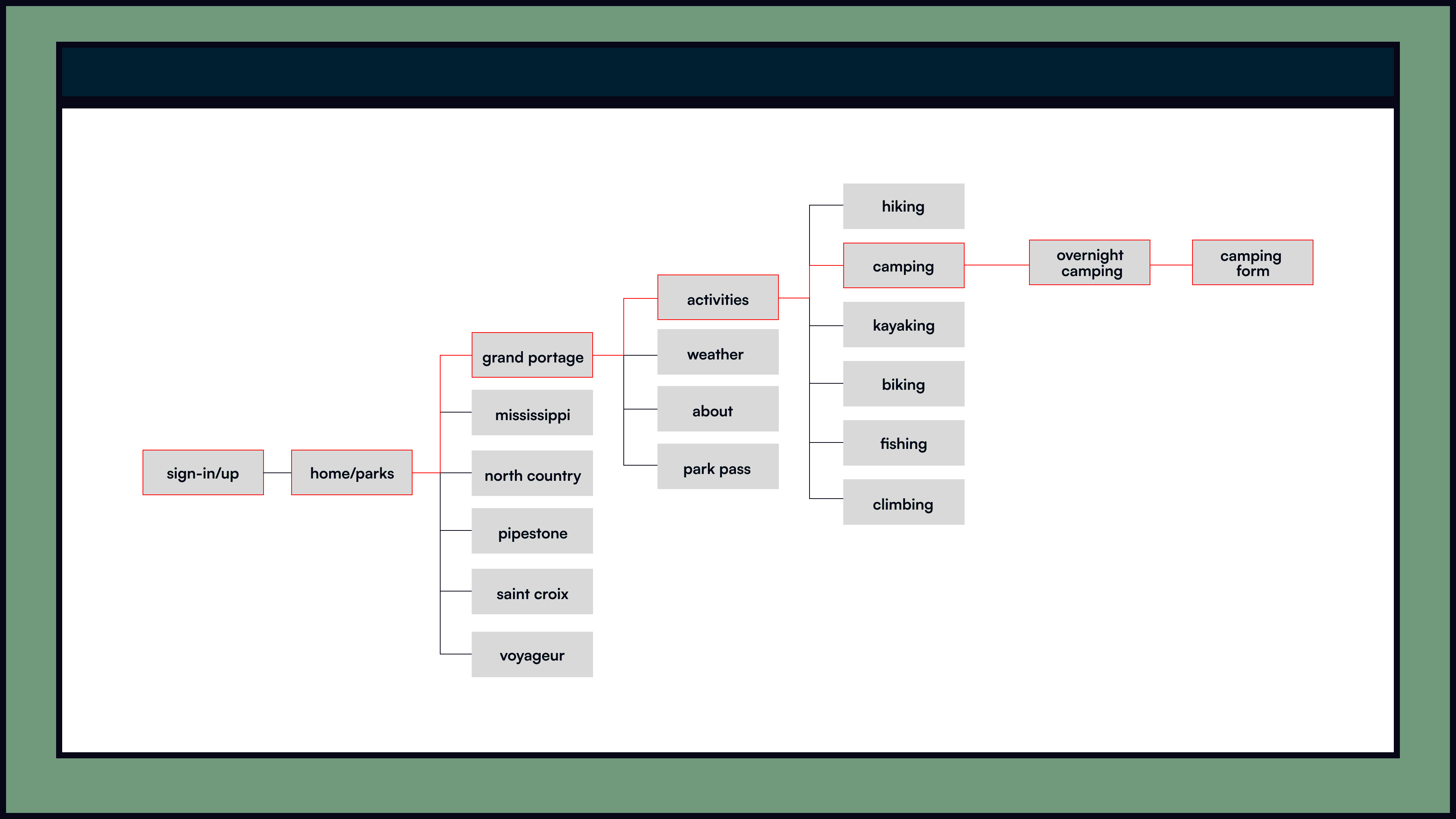

App pages
MN Parks
App Design
My Role
UX DESIGNER
Timeline
1 month
THE PROBLEM
Minnesota's state parks need a central hub of information for their respective parks across the state to enhance visitor experiences, increase accessibility, and promote the state’s natural resources.
THE OBJECTIVE
Provide an app tailored to Minnesota’s state park visitors and create deeper connections between people and nature while supporting conservation and tourism efforts.
RESEARCH
Target Audience
User Interviews
User Persona
PAIN POINTS
Bear Tracker
Number one concern of interviewers was wild animal encounters.
Activities
What type of activities and services does the park offer?
Trails & Maps
Accurate trails and maps to iconic destinations and campsites.
SOLUTIONS
Bear tracker that allows park rangers, or visitors to mark wild bear sightings in real time.
Activities section that shows activities available, with updated schedules and seasons.
Multiple maps and trail direction for hiking, rock climbing, and off road biking.
Color Palette
For the color process I used the 60, 30, 10, rule. The rule states that a color scheme should consist of three colors in intervals of 60% (main color), 30% (secondary), 10% (accents). By following this system it helps the design keep balanced proportions.
I chose cool colors for my palette to reflect the calmness and tranquility found in nature. Also, I chose variations of green and blue to imitate the color of grass and water, while using an eggshell white as the neutral color for the app.#F4F2EC
60%
30%
#719A7C
10%
#001F30
TYPOGRAPHY
Satoshi is a sans-serif typeface inspired by Modernist graphic design
Satoshi is a modernist sans serif typeface. Its design combines typically grotesk-style letterforms, with some characters that are quite geometrically-designed.
Satoshi is a modernist sans serif typeface. Its design combines typically grotesk-style letterforms, with some characters that are quite geometrically-designed.
Aa
Aa
Aa
Aa
Aa
Light
Regular
Medium
Bold
Black
Info Architecture
App pages